Saturday, February 21, 2015
Inspiring Curiosity
Yes! Another Compendium of Curiosities 3 Challenge completed. If you haven't check out Linda Ledbetter's challenge, maybe you should. This is Challenge #22 and uses the Dimensional Cutting Pad as shown in "A Compendium of Curiosities Volume III" by Tim Holtz. On page 62 you will find 6 detailed photos along with detailed instructions that walk you through, step by step, how to use the Dimensional Cutting Pad. At Linda's blog you will find the challenge details and 9 fabulous projects created by the Curiosity Crew using this technique. If you don't have a Dimensional Cutting Pad yet, you may want one after seeing what Linda and her crew created. Everything from cards & tags to an art journal page. There's even a home decor project for a fireplace mantel that doubles as an accordion album.
Challenge #22 is sponsored by The Funkie Junkie Boutique who has provided a gift certificate to one lucky winner so they can go shopping at their excellent online boutique. They not only carry Tim Holtz products but have just about anything you need for your vintage projects. You can even set up a wish list (which I have)! There is also a special prize awarded (thanks to Tim and Mario!) to The Curiosity Crew's Choice and the lucky selectee not only wins an amazing prize package but also gets a banner for their blog. Too Cool!
I did something a little different this time. I started with a #12 size tag. At 5 1/8" x 10 1/2", this tag is huge compared to the size I usually use. Why so big you might ask? Two reasons. The first is I wanted to use at least one product, technique or idea from each crew member's tag that inspired me. I needed lots of room because they are very inspiring. The second is I love Wallflower Paper Stash and especially the page with the two birds side by side on the branch. With the #12 tag I had enough room to use the 12x12 size which has the largest image of the birds and still have room for my die cuts.
Lots of fun techniques here. Everything from Distress Ink, to Distress Markers, Tissue Tape and Remnant Rubs to Idea-ology, Stencils, Stamps to Die Cuts and Papers. That is real bird seed in the vial and I didn't have green felt so the leaves for the felt flower was die cut from white felt and colored with Lettuce Alcohol Ink and Blending Solution.
I always want to give thanks to Tim Holtz for all his amazing products, tutorials and ideas and to Mario for his hard work behind the scenes and his amazing BTS updates and to both for their generosity is making time in their busy schedule to share so much.
This week I also want to thank Linda, Anita, Annette, Candy, Cheryl, Hels, Marjie, Susan and Yvonne.
Even though I used something inspiring from everyone's project here, there are still plenty more ideas that I can use to jump start another project. You guys inspire me... all the time.
P.S. Linda's challenge is open through Friday, Feb 27.
Friday, February 13, 2015
Coffee Time!
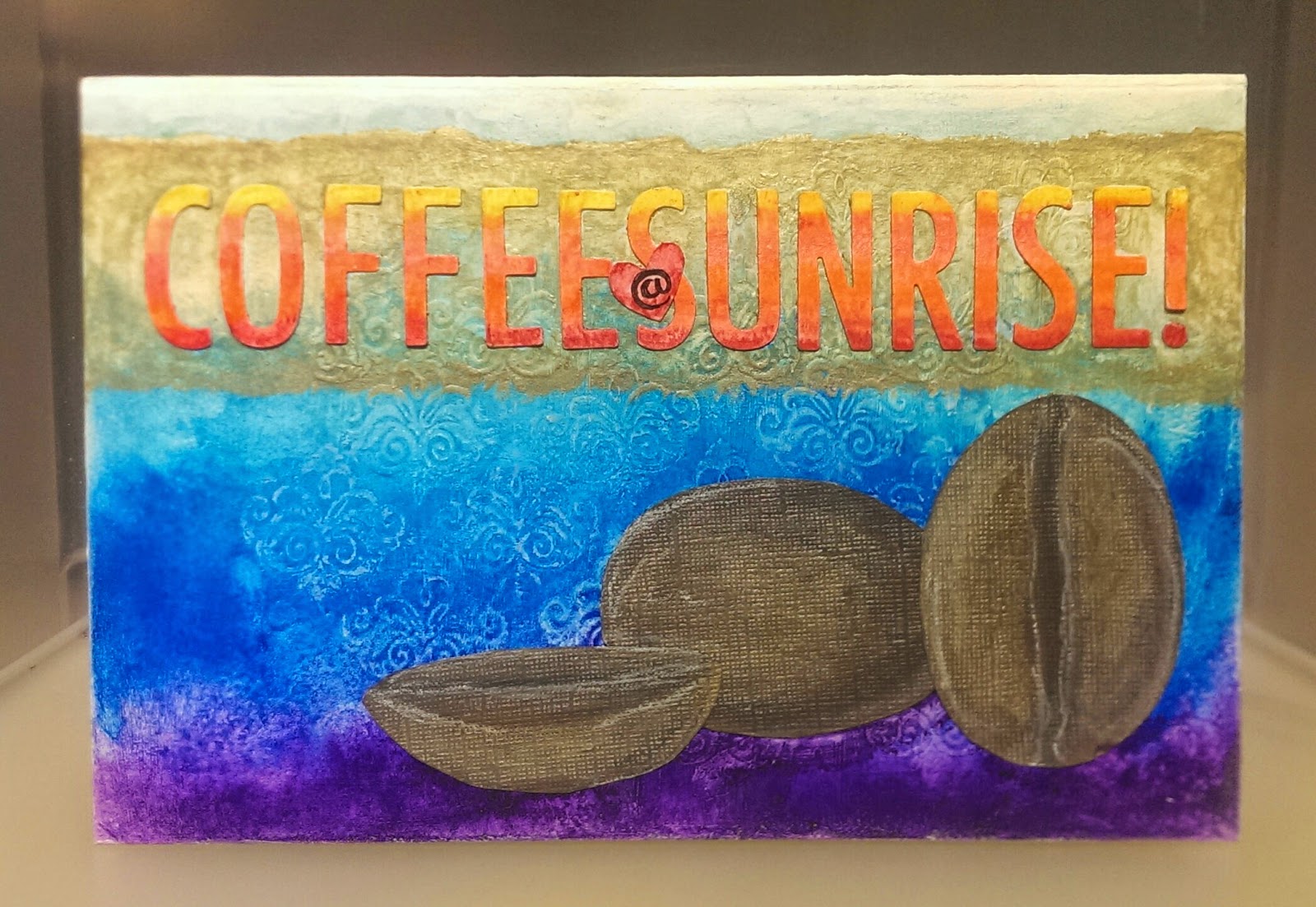
I love coffee in the morning. Imagine a perfect day starting with a fresh brewed cup of coffee, on a quiet and peaceful balcony somewhere overlooking a gorgeous view and watching at a beautiful sunrise. At least that's what I was thinking of when reading about Mou Saha's Faber-Castell project challenge.
Mou Saha is a wonderful mixed media artist and she has an excellent blog, http://collagecollagecollage.blogspot.com/. She also has a monthly challenge at Faber-Castell Design Memory Craft. The theme for this month is to create a project about your favorite beverage. I had a box that is the perfect size for my gelatos that I wanted to decorate so I decided to give it a try. You can find Mou's February challenge here.
I used gesso to prep the lid to the box. I used a little flourish stamp that came with a set of blue Faber-Castell Gelatos to heat emboss a repeating pattern across the surface and then gessoed over it again. This gave me a texture to allow the gelatos to pool. I used Coconut, various blues and purple to create an ombre. Once it was completely dry, lightly applying coconut over the raised areas helped to define the flourishes. Using Gold Champagne, Squid and Coconut, I sketched three large coffee beans on dark brown distress core'dinations paper then cut them out and glued them down. Love the coverage, shimmer and shine. I used another ombre of Bannana, Bubble Gum, Metallic Mellon, Tangerine, Blood and Red Cherry for the letters. Then finished my project with a Gold Champagne banner behind the Coffee @ Sunrise banner.
This challenge ends today but Mou has a new one the first Monday of each month. If you have any Faber-Castell products, these are both great blogs to find fun, creative and inspiring ways to use them
Thursday, February 12, 2015
Rock Candy Distress Glitter Wishes
Compendium of Curiosity Challenge # 21 |
I had participated in the last couple of challenges and decided to join in on this challenge too. I had fun with the technique and made 3 different backgrounds. I used basically the same colors and stamps but changed up which element got what color. Each background had things I liked about it and I finally picked one for my project only to change my mind half way through. Fortunately all of my elements hang from a couple of chains through the top of the tag so it was simple to switch out the background.
One of the things I wanted to do was use all the stamps from one stamp set on my project. I selected Tim Holtz Royal Script CMS016 from Stampers Anonymous. The colors of Distress Ink I used were Old Paper, Antique Linen, Victorian Velvet, Spun Sugar, Seedless Preserves, Dusty Concord, Weathered Wood and Peeled Paint.
I used Sizzix Premium Crease pad when cutting the tag out of vellum. It keeps the paper from tearing or cutting on the crease lines. I stamped the crown on the front of the Vellum and embossed with Ranger's Fine Detail Clear Embossing Powder. I used Spun Sugar Distress Marker to pick up Dusty Concord Distress Marker scribbled on the non stick craft sheet to color and blend the border on the back side of the vellum to frame it.
I wish you could see the sparkle! |
The foil letters are die cut from Tim's Alterations Carnivale for WISH. They were then embossed with the embossing folder (also using the Premium Crease Pad) and painted with Spun Sugar Distress Paint. Once dry the letters were lightly sanded and inked with Victorian Velvet and heat set. Then I use Spun Sugar and Seedless Preserves to color a torn strip of manilla tag adding the letters to it and pop dotting the strip on top of the vellum under the crown.
I used silver mixative to alter the ball chain, fleur-de-lis and the jump rings so they would complement the pearls which had silver findings. I was able to easily cut the ball chain to the lengths I needed with Tim's tonic scissors and then add the pearls with the jump rings. I just punched small holes in the center top and bottom of the vellum and put everything together.
I started with the background on the left but switched to the one on the right. |
Of course there is also a Curiosity Crew Pick who wins an amazing prize from Tim and Mario and the fun of playing along. As always I encourage you to check out the lovely inspiration at the challenge post here.
Sunday, February 8, 2015
Looking forward to Spring with 12 tags of 2015 February
My last post had a Valentine theme so I decided to go with spring for this tag. I love Tim's Wallflower Paper Stash from Idea-ology. I decided to use it and various stickers from my stash of Idea-ology to create my collage background. I followed Tim's directions to create my base. I really love the dimension the shading with the distress markers added. Tim used Black Soot but I decided to use Frayed Burlap for a softer look. Applying it over the dried Glue N' Seal makes blending easy. If you check out Tim's post you will see step by step how he creates his tag. Here is the link http://timholtz.com/12-tags-of-2015-february/
I used Tim's Tattered Floral die to die cut the small flowers from white felt. The edges are lightly inked with the blending tool and Barn Door distress ink. The flower centers are Tim's mini brads painted with Mustard Seed Distress Paint. I used the poinsettia from the Mini Cardinal and Poinsettia mover and shaper die for the leaves. It is cut from green cardstock and then divided into 3 sections and inked, then tucked behind the flowers.
Blending with Distress Ink |
In January Tim Holtz tweeted:
"2015 is the year to make time for yourself each month to do something creative! the #12tagsof2015 is the perfect way to start - full tutorial on the blog... #timholtz"Thanks for the Inspiration Tim!
Sunday, February 1, 2015
Do something different everyday.
Tim Holtz January tag is gorgeous as usual. If you haven't seen his tag you can check it out here http://timholtz.com/12-tags-of-2015-january/.
For this project I used Tim's techniques but also decided to use some ideas from Paula Cheney at One Lucky Day.
Paula created and posted a calendar back in October and it is gorgeous. When I was looking at Tim's January Tag for 2015 it reminded me of Paula's calendar. Instead of creating a tag I worked on a wood base and created a calendar (Paula's idea) but otherwise followed Tim's step by step process. I printed Paula's calendar pages that I downloaded from her blog. Paula started with a wood base but her technique and look is totally different. If you have thought of making a desk calendar you should check it out. Here is the link http://www.oneluckyday.net/2014/10/the-2015-calendar.html.
Tim's Chit Chat letters came with 2 white sheets and 2 kraft. The white words are randomly place for inspiration for this coming year. I used the kraft words to create the phrase "Do Something Different Everyday and at the bottom right corner "Embrace Imperfection" To remind me to loosen up a little and look for adventure every day.
Subscribe to:
Posts (Atom)