Showing posts with label Tim Holtz Inspired. Show all posts

Saturday, July 4, 2015

July 4th and Tim's 12 Tags of 2015

Happy 4th of July. 


I hope everyone is having a fun holiday. I have had some fun time with my family earlier today. We went to the movies and then my husband cooked some of his wonderful hamburgers and home cut fries. He is an amazing cook.  While he cooked I worked on my July 12 Tags of 2015 tag. I had made the plaid background using Tim's plaid technique from June and for the rest I wanted to follow Tim's tag as close as I could but I did have a few little variations.

For the 4 and the stars I used some grungeboard shapes in my stash. I bought so many sets when they first came out I may never run out. I dabbed some White Distress Crackle Paint on them and let them dry during dinner. Once we were through enjoying our meal the crackle paint was dry and I was able to put everything together. Here's my tag for this month. I think this may be the earliest I have ever finished one.

I Love seeing Tim's July 4th projects every year. Check out Tim's tag at 12 Tags of 2015 for July and his post for Patriotic Inspiration for some more ideas and his great tutorials.

Tuesday, June 30, 2015

June 12 Tags of 2015 - Coffee!

So What's Your Favorite Brand of Coffee?


I grew up with the "Good To The Last Drop!" coffee in my house. It's still my favorite. However Tim, Mario and my coffee drinking daughter Sarah are fans of another brand. If you are a Tim fan you know which one it is.

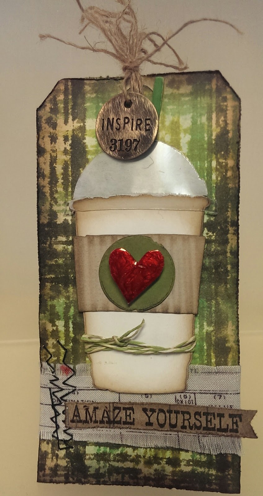
When I saw Tim's tag this month I knew I had to make it. I really lucked out this time too. I don't have the coffee die but Linda at The Funkie Junkie Boutique encloses little goodie bags in her orders. I always find fun little surprises in these gift bags. I remember that she had enclosed a set of the coffee diecuts in the goodie bag with my last order. (Thanks Linda!) It was before Tim posted the June tag so it was just turned out lucky for me that I hadn't used them yet. The pieces Linda sent me were white except for  the corrugated band and the acetate top. I think the white cup turned out great on my tag.

I Love Distress Minis!
I followed most of Tim's directions with a few changes here and there due to what supplies I had on hand. I was so excited when I saw Tim's plaid. I was able to recreate my plaid using Distress Minis with his Stripes Layering Stencil. The first tag I did was with Festive Berries, Weathered Wood and Faded Jeans. I loved the way it looked but quickly realized that I had skipped Tim's first step.

When I realized what I did (or didn't do) I decided to start over. One reason was because the technique was so quick and easy. Another  was that I really need to play more with my Distress Sprays and finally I decided to use shades of greens. I'll use my Red, White and Blue tag for a July project.
Can you see the shimmer?

I spritzed my tag with water then Cracked Pistachio Distress Stain. I decided I wanted a little shimmer so I used Perfect Pearls Mists in heirloom gold instead of plain water for the drips and splatters step that was next. The colors of Distress Minis I used for my plaid were Forest Moss, Mowed Lawn and Crushed Olive.

I wanted a heart where Tim used a star. I freehand cut one out of Clearly for Art Modeling film by Wendy Vecchi. I painted it with Brushed Pewter Distress Crackle Paint and when it was dry added drops of Watermelon Alcohol ink.

I still don't have any of Tim's burlap so I used fabric from Tim's Eclectic Elements Line. The phrase I used is from Tim's stamp set Way With Words CMS165 from Stamper's Anonymous.

I always find such wonderful inspiration and tutorials at Tim's blog. If you want to see Tim's June tag and check out his great tutorial click here. Another place to get ideas for using Tim's products is the Ranger Ink blog. If you'd like to see some fun projects the Ranger Artists created after being inspired by Tim's June tag click here.

Tuesday, June 23, 2015

Layering Stencil Fun for the Compendium of Curiosities 3 Challenge

I had such fun working on my entry for Challenge #31 at Linda Ledbetter's Compendium of Curiosity 3 Challenge. Layering Stencil: Paint Resist that I posted a couple of photos of my work in progress shots on Instagram. Did you see them? Here is the completed tag.


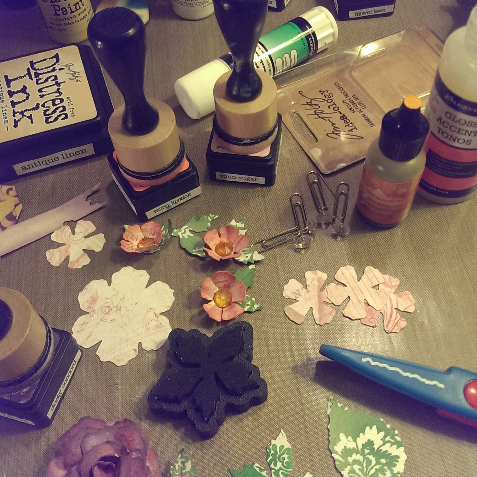
The background of my tag was created using the technique from page 47 of Tim Holtz's "A Compendium of Curiosities Volume III". I used Picket Fence and Mustard Seed Distress Paint and Spun Sugar, Worn Lipstick, Dusty Concord and Squeezed Lemonade Distress Ink along with the Harlequin and Flourish Stencil but as to how I did it you will need to check your own copy of the book. 
Rules for the challenge are here and loads of inspiration for the technique is here.
Sponsor of this challenge is Inspiration Emporium.  They are generously donated a $50 gift certificate that some lucky winner can use to purchase some more goodies. If you want to check them out click here.

I realized I needed more of the smaller flowers.
Alcohol Ink on Gems

After finishing my base tag, I decided to create some flowers using one of my favorite dies, Tattered Florals. I used the pink pattern paper from Tim's Vintage Shabby Paper Stash.  For the smaller flowers I used the smallest flower on the Tattered Florals die and after inking it up and shaped the petals with my fingers. For the centers I took the gems off the ends of Tim's Idea-ology "Gem Clips" and colored them with Butterscotch Alcohol ink then glue them into the center with Glossy Accents.

Making leaves and flowers
The leaves for the smaller flowers are die cut from the Motif paper stash which includes both white and kraft colored paper with varnished designs that resist ink. I inked the paper up with Bundle Sage and Mowed Lawn Distress Inks, then die cut them with the small Poinsettia mover and shaper die. I cut each poinsettia into sections with 2 petals for each flower. For the larger leaf, I hand cut a leaf shape using my very old deckle edged scissors. (I started scrapbooking when these were cutting edge technology!) I glued the leaves to the flowers. Once everything was dry I started playing around and arranging the flowers.

I used the Tattered Floral Die for the large rose. I used Dusty Concord Distress Ink and a blending tool over the Vintage Shabby die cuts. I won't go into all the details here but here is a link to a really good turorial by Hels Sheridan, one of the Curiosity Crew members, for a large rose.  It's not exactly how I made mine but really close.

I used the Tattered Banners die and Remnant Rubs to create my banners, and finished up my tag by adding a few Idea-logy embellishments colored with alcohol inks and of course a ribbon bow.

My Layering Stencil: Paint Resist tag before I started putting everything together.

Friday, June 5, 2015

Eroded Metallic - Compedium of Curiosities 3 Challenge 29


On page 44 of "A Compendium of Curiosities Volume III" you will find the technique for the latest challenge from Linda Ledbetter and the Curiosity Crew.. Eroded Metallic is a gorgeous technique and the Curiosity Crew has created another amazing array of inspiring art.

The Sponsor for Challenge 29 is Inspiration Emporium,  They are generously giving away a $50 gift certificate to one lucky participant. Tim and Mario have also donated some prizes to be given to the Curiosity Crew's Choice. So 2 chances to win! Wish me Luck!!!

I decided to use this technique to alter a chipboard box I have had for quite some time. I actually finished the Eroded Metallic technique part last week. And I have been looking at it ever since. I just couldn't decide how I wanted to embellish it.

When I was a little girl, someone told me that when I saw a Cardinal it was a sign winter was here. It wasn't until recently I found out this wasn't true. I did a little research and found out they stay in the same territory all year long. When I won my Christmas Cardinal die (Thanks Linda and Crew) I knew I wanted to use them on something that wasn't obviously winter so they are the focal point and inspiration needed to finish my box.

Of course, I can't tell you how to do the Eroded Metallic technique. It is against the rules. But if you've enjoyed reading my tutorials in the past and would like to see a one on this project, just let me know. I'll make a separate tutorial page and post it in a few days. (without the Eroded Metallic technique of course).


Sunday, May 31, 2015

Last Day for Tim's May 12 Tags of 2015

I'm not the only one to wait to the last day to post my version of Tim's May 12 Tags of 2015. Many of the blogs I follow were posting their May tag yesterday and today too.

I don't have some of the products Tim used. Of course not having a particular product doesn't mean I can't make Tim's tag. I just have to be more creative. So instead of Burlap (which really looks fun to work with) I used his Burlap Texture fade and a Kraft tag. There were a few other things I don't have but they are on my wish list. So I decided to throw caution to the wind and get creative.

I used Abandoned Coral and Spun Sugar stain on the ribbon. The Chit Chat letters are colored with Distress Markers. The foliage is from Tim's Christmas Cardinal die. The musical notes are Remnant Rubs. The Singing bird, the 45¢ and the Crown savings stamps are from the Thrift Shop ephemera pack but the Nests and Eggs image is clipped from the 3x3 designs in the Wallflower Paper Stash. The eggs are colored with a Cracked Pistachio Distress Marker. I also used Idea-ology embellishments.

One thing I have been busy working on this week is my collection portfolio. I love Tim's Wallflower Paper Stash so that's what I'm using for my folio.  I am making lots of little pockets to add throughout the pages. I decided that once I made my May tag I could turn it into a pocket too.

After I finished my tag, I made an little bag out of Melange Tissue Wrap and glued the tag to the front with glossy accents.
The back of the bag is reinforced with a sheet of cream cardstock. The card is cut the same size as the bag. I used the flourish stencil and applied Walnut Stain distress ink with the mini blending tool. The cardstock was larger than the stencil so I turned the stencil sideways so I could apply the ink edge to edge.  One thing I quickly discovered was that the pattern repeated from side to side, overlapping by about a 1/4".  If you look closely at the small picture of the stencil you'll see the edge of the stencil under my thumb and that the area already inked is lining up with the stencil after I repositioned it further down the card.

I used the Mini Baroque Movers and Shapers die to cut a topper for the card. I cut it in half, inked it up and glued it to the top of the card then glued the card to the back of the bag.


You can check out Tim's tag here.

Friday, May 22, 2015

CC3C 38 Alcohol Ink Ombre, Remembering the Moment


Here is my tag for Compendium of Curiosities 3 Challenge. If you are curious about Alcohol Ink and want to know more or even if you like working with them and just want some inspiration, you should check out this challenge. Linda Ledbetter and her Curiosity Crew create beautiful artwork for this bi-weekly challenge that promotes Tim Holtz's A Compendium of Curiosities Volume 3 and this week they all used the Alcohol Ink Ombre technique.

The background of my tag is created with Tim Holtz's Alcohol Ink on Gloss paper from Ranger. The technique is Alcohol Ink Ombre shown on page 57 of Tim's Volume 3 of A Compendium of Curiosities.

I've also used Wendy Veccki's Clearly for Art modeling film and Tim Holtz wood block Butterfly Stamp E1-1538 from Stampers Anonymous for the butterflies. I stamped the butterflies with Archival Jet Black ink on one side. On the other side of the film I used the Alcohol Ink Ombre technique. Then I cut out the butterflies and heated the modeling film with my heat tool and shaped it. Once it cools it holds the shape. You can heat it as many times as you need until you get the shape you want.

The other stamps I used are also from Stampers Anonymous, Urban Chic CMS086 and Mini Cirque CMS079.

Funkie Junkie Boutique is the sponsor of Challenge 28. I've shopped with Linda before and she has great selection and prices. Of course she has wonderful customer service too. There is also a chance to win a special prize (donated by Tim Holtz and Mario Rossi) awarded to the Curiosity Crew's Choice. Check out all the details at Linda's blog. This challenge ends tonight at midnight but a new one will start tomorrow.

I love the challenge and I love Tim's book. Of course I'm not the only one. There are quite a few talented artist that link their artwork to CC3C so If you are looking for inspiration you will find it just a click away.

Thursday, April 30, 2015

Throw Back Thursday and Scrapbooking


A long time ago I started scrapbooking. I needed a hobby and I had plenty of pictures. I don't scrapbook often anymore, but I still enjoy it. I realized I haven't posted many of my scrapbook pages and since today is Thursday I thought I would have Throwback Thursday Post. This is one of my favorites created a while back I don't believe I ever posted it.

Even though it is a scrapbook page you can see I'm still using my Tim Holtz products. The paper is from the Seasonal Paper Stash. There are several different papers for each holiday or season. The 12x12 pad has a variety of design sizes, from full page design to 6x6 designs, 2x2 snippets, ATC sizes and borders. "SWEETHEART" is cut out of the 12x12 background paper and mounted on grungeboard. After inking the edges and adding Rock Candy Distress Glitter over the top (it looks like sugar is sprinkled over the top) I placed it on a torn strip of one of the other Valentine sheets, inked up the edges and placed it back over the area cut out from the background. The ephemera cards are cut from the snippets sheet. They remind me of little valentines.

The winged hearts are die cut from Grungeboard and painted with Distress Crackle Paint then inked with a blending tool with what is probably Walnut Stain Distress Ink but it may have been Vintage Photo.

The large picture is one my sister, June, took when she was taking her photography courses in college. I love this photo because Mama hated having her picture taken. Daddy just wrapped his arms around her and whispered something in her ear that made her laugh. My sister was able to capture the smile. I selected 5 more pictures of my parents together from different moments in their life together and printed them out very small, added them behind the Filmstrip Ribbon and used the Tiny Attacher to mount it to the page.

I made this page after my parents passed away but before the scrapbook store I worked at part time closed. It hangs in my studio where I can see it and think about how much my parents loved not only each other but all six of their children. I find that when I lose someone I love it helps me to create something in their memory to help me cherish my memories of them.


Saturday, April 25, 2015

So Many Stamps to choose from...

When I realized that time was running out for the Smudge Stamping Technique at Linda Ledbetter's Compendium of Curiosities 3 Challenge #26 I got out all of my Tim Holtz stamps, my Distress Inks and my #8 manilla tags and started playing. I ended up using 8 stamps from 5 different sets. After 3 attempts I figured out the right placement of the stamps and colors I wanted to use. One thing I found out quickly is that this is a fun technique and I will be using with it more.

Curious about how it's done? Get out your copy of Compendium of Curiosities Volume III and turn to page 42 to find out all about Smudge Stamping. Don't have your own copy you can buy an autographed book from Tim here.

Want to see some more examples? Go to Linda's blog and see the amazing art she and the Curiosity Crew created. You can even check out the art from other creatives who have answered the challenge.

The sponsor for this challenge was The Funkie Junkie Boutique. If you follow my blog you will know there is also a Curiosity Crew Choice winner (who wins a box full of goodies donated by Tim and Mario!), and an honorable mention.

 I'm keeping this post short tonight. I had so much fun I lost track of time and it is awfully late here in Georgia. Lucky for me the challenge is open until 11:59  MST.

Tuesday, April 14, 2015

Texture, Layers and Frameworks for Tim's April 12 Tags of 2015

Just so you know and in case you haven't seen Tim Holtz's April 12 Tags of 2015, I didn't use the same techniques Tim did this month. But I did use his design for his April tag to complete one of the framework tags that I created earlier this week. In my last post I shared that I was having so much fun working on my entry for the Compendium of Curiosities 3 Challenge #25 Frameworks that I made 3 backgrounds. I worked on all 3 simultaneously until I reached a point where I could decide which one to finish for the challenge.

The background for this tag is one I didn't use for the challenge because I really liked it so much I didn't want to cover it up. I was saving it for later. This weekend when I was thinking of Tim's April tag and wishing I had the Flower Garden Stamp (It's the next stamp on my wish list), I realized that even though I didn't have the stamp to use for the wonderful water coloring effects Tim had demonstrated, I could use my frameworks background and some of Tim's other products to create a different version of the April tag. The April design would let the background shine through instead of hiding it.

I started with a Kraft tag I embossed with one of Tim's embossing folders. Then I lined up a couple of the extra honeycomb frames I had die cut with the Frameworks diecut I was keeping on the tag, taped them down and used them as stencils. After applying some texture paste thinly over parts of the dry embossed tag, I removed the stencils. Once the paste was dry I then inked it up with Distress Ink. You can see the dry embossing peeking through the paste. Love the texture.

Keeping in the spirit of the CC3C Guidelines, I'm not going to go into the detailed instructions for the rest of the Frameworks technique because they are in Tim's book. He does an excellent job showing fun ways to use the die and has beautiful step by step photos. You'll find them on page 64 of his book, "Compendium of Curiosities Volume III". 
 
To create my Black-Eyed Susan flowers I used some techniques from "A Compendium of Curiosities" Volume II. I used Tim's Crumpled Kraft Suede Technique from pg 40 on Glassine paper to create the flower centers and then on watercolor paper to create the flower petals. The petals were die cut from Tim's Tattered Florals die and water colored with Distress Markers. The paper twine for the flower stems and for the top of the tag was colored with Cracked Pistachio Spray. The Grungeboard star is from a stash I created when first learning the Shattered Stains technique also explained in Volume II on page 48.

Since my background was already created on a No. 8 tag and I didn't want to trim it down, I used a larger Kraft tag and trimmed it down to leave a 1/4" border on the sides and bottom with a little more room at the top. Then I followed Tim's instructions to cut the 1" strip for my tag to weave through and for the word LIFE to be die cut out of, letting the tag underneath show through. Yes, I do have Tim's ruler and it makes this step so easy. I don't have the Adventure Words dies that Tim used so I die cut my letters out of cardstock with Tim's Alterations Chipped Block die strip, glued them down and carefully cut them out with a craft knife. I inked the backside of the tag where the letters are cut out to add definition. Love the effect of the negative space. The Adventure Words block dies would be fun to use and time saving dies to have.

To finish off my tag I added the machine stitching as shown on Tim's tag. I used the Chit Chat word "beautiful" and colored the edge with Cracked Pistachio and a waterbrush. I really like how my April tag turned out but when I get the Flower Garden Stamp I will revisit the Tim's April tag and try out these techniques. I really love the spritzed background.

Now I have another tag inspired by Tim Holtz 12 Tags of 2015. Tim has a way of showing us how to use his products in ways I haven't imagined yet. That's why I follow his blog, have his books, have taken his Creative Chemistry Classes and love his products. He encourages us to be curious, try new things and get our fingers inky. His tag is gorgeous this month and I really hope you visit his blog here and see it.

Friday, April 10, 2015

Fly with Courage. Frameworks - CC3C Challenge 25

Linda Ledbetter's  Compendium of Curiosities 3 Challenge # 25 comes to a close tonight and I have finished my tag. The challenge is to open your copy of "Compendium of Curiosity Volume 3" by Tim Holtz, turn to page 64 for Tim's instructions and tips on how to use his Frameworks die. Then create something fun and link it up to Linda's Blog.

Inspiration Emporium is the sponsor for the challenge and one lucky winner will receive a $50 gift certificate. There is also a Curiosity Crew Choice winner who gets an amazing box of goodies that Tim and Mario donated along with a badge for their blog and one more person gets an honorable mention along with a badge for their blog.

I've had so much fun with my Frameworks die that I was working on 3 different backgrounds at the same time. I have one background I like too much to cover up yet and one that I am definitely seeing some definite possibilities for and the one you see here.

Botanical Sketch.
The one I decided to go with for the challenge is the one that everything just seemed to pull together on. Once I got to a certain point I just couldn't stop. The background of the tag was created using Tim's wrinkle free distress technique in a variety of blues. Then I used a section of the Botanical Sketch Stamp CMS216 and Chipped Sapphire to stamp the edges on both sides of the tag then embossed with Antiquities Frosted Crystal from Ranger. This adds dimension without the gloss and I love the feel.  I inked up a ribbon and ran it down the center of the tag to cover the gap.

The next step was to use the Framework die so check out Tim's book for the instructions.

I used all the butterflies from Thrift Shop Ephemera Pack. I used Distress Markers and a water brush to colorize the front and back of the butterflies, and the edges of the wings. I shaped the body and wings to give them more dimension. The largest is up on 2 sets of pop dots. The Oval and smaller butterflies are on one layer of pop dots. You can see the back of the butterfly wings reflecting in the mirrors.  I also used Industrious Stickers, Remnant Rubs, and paper twine.

I love my Distress Inks. Whether using ink pads, markers, stains or sprays, there are so many ways to apply and alter these amazing inks to paper, fabric, ribbon, twine and more.

If you are looking for more inspiration for Framework dies check out what the Curiosity Crew did at Linda's blog. You'll find more amazing pieces of art. Tags, cards, art journal page and a canvas. You can also find inspiration in Tim's books and on his blog. Oh! I was testing the link and this just saw this! He just posted on his blog this morning that he has 4 new products! Got to Go and watch the product videos!
You'll be seeing the backgrounds on the left and right soon!
have courage, FLY!

Edited to Add that I did finish the brown background. I used it to create my April tag inspired by Tim's 12 Tags of 2015. You can see it here.

Tuesday, March 31, 2015

Tim's March 12 Tags of 2015

If you want to see Tim's tag look here http://timholtz.com/12-tags-of-2015-march/. It was the inspiration for the tag I'm posting today, this last day of March.

I had so much fun with Distress Paints over Tim's tissue tape. The stamp I used here is from Creative Muse CMS046. One of Tim's earlier sets, it includes the infamous Umbrella Man. I needed a stamp with not only a solid area but an open area too. I picked the Rook Card because it reminds me of when my parents used to play Rook when I was a small child.

The most fun though was using a mask with a stencil and embossing paste and then using embossing powder on top of that. You can see step by step pictures on Tim's blog.
Let me just say that the effect is gorgeous.
Grungeboard and Rock Candy Crackle Paint
I Love Tim's Buckles!

I've also used some Remnant Rubs, some grungeboard with Rock Candy Crackle Paint along with Distress Stains and Alcohol Ink, and Filmstrip Ribbon.

Tim will have a new tag to inspire us in April and I've seen quite a few Easter theme works of art on his blog this month so I am really excited and looking forward to seeing his next 12 Tags of 2015.


Saturday, February 21, 2015

Inspiring Curiosity


Yes! Another Compendium of Curiosities 3 Challenge completed. If you haven't check out Linda Ledbetter's challenge, maybe you should. This  is Challenge #22 and uses the Dimensional Cutting Pad as shown in "A Compendium of Curiosities Volume III" by Tim Holtz. On page 62 you will find 6 detailed photos along with detailed instructions that walk you through, step by step, how to use the Dimensional Cutting Pad. At Linda's blog you will find the challenge details and 9 fabulous projects created by the Curiosity Crew using this technique. If you don't have a Dimensional Cutting Pad yet, you may want one after seeing what Linda and her crew created. Everything from cards & tags to an art journal page. There's even a home decor project for a fireplace mantel that doubles as an accordion album.

Challenge #22 is sponsored by The Funkie Junkie Boutique  who has provided a gift certificate to one lucky winner so they can go shopping at their excellent online boutique. They not only carry Tim Holtz products but have just about anything you need for your vintage projects. You can even set up a wish list (which I have)! There is also a special prize awarded (thanks to Tim and Mario!) to The Curiosity Crew's Choice and the lucky selectee not only wins an amazing prize package but also gets a banner for their blog. Too Cool!

I did something a little different this time. I started with a #12 size tag. At 5 1/8" x 10 1/2", this tag is huge compared to the size I usually use. Why so big you might ask? Two reasons. The first is I wanted to use at least one product, technique or idea from each crew member's tag that inspired me. I needed lots of room because they are very inspiring. The second is I love Wallflower Paper Stash and especially the page with the two birds side by side on the branch. With the #12 tag I had enough room to use the 12x12 size which has the largest image of the birds and still have room for my die cuts.

Lots of fun techniques here. Everything from Distress Ink, to Distress Markers, Tissue Tape and Remnant Rubs to Idea-ology, Stencils, Stamps to Die Cuts and Papers. That is real bird seed in the vial and I didn't have green felt so the leaves for the felt flower was die cut from white felt and colored with Lettuce Alcohol Ink and Blending Solution.

I always want to give thanks to Tim Holtz for all his amazing products, tutorials and ideas and to Mario for his hard work behind the scenes and his amazing BTS updates and to both for their generosity is making time in their busy schedule to share so much.

This week I also want to thank Linda, Anita, Annette, Candy, Cheryl, Hels, Marjie, Susan and Yvonne.

Even though I used something inspiring from everyone's project here, there are still plenty more ideas that I can use to jump start another project. You guys inspire me... all the time.


P.S. Linda's challenge is open through Friday, Feb 27.

Thursday, February 12, 2015

Rock Candy Distress Glitter Wishes

Compendium of Curiosity Challenge # 21
Want a gorgeous sparkly background for your next project? Use Rock Candy Distress Glitter. If you've never used it before, check out Tim Holtz's Compendium of Curiosities Volume 3 pg 55 for a step by step picture tutorial. This is the technique the Curiosity Crew selected for Challenge #21 of Linda Ledbetter's CC3 Challenge. I wish I could capture the sparkle of the Rock Candy. You can't really tell from my photos but it is covering the wings on the tag.

I had participated in the last couple of challenges and decided to join in on this challenge too. I had fun with the technique and made 3 different backgrounds. I used basically the same colors and stamps but changed up which element got what color. Each background had things I liked about it and I finally picked one for my project only to change my mind half way through. Fortunately all of my elements hang from a couple of chains through the top of the tag so it was simple to switch out the background.

One of the things I wanted to do was use all the stamps from one stamp set on my project. I selected Tim Holtz Royal Script CMS016 from Stampers Anonymous. The colors of Distress Ink I used were Old Paper, Antique Linen, Victorian Velvet, Spun Sugar, Seedless Preserves, Dusty Concord, Weathered Wood and Peeled Paint.

I used Sizzix Premium Crease pad when cutting the tag out of vellum. It keeps the paper from tearing or cutting on the crease lines. I stamped the crown on the front of the Vellum and embossed with Ranger's Fine Detail Clear Embossing Powder. I used Spun Sugar Distress Marker to pick up Dusty Concord Distress Marker scribbled on the non stick craft sheet to color and blend the border on the back side of the vellum to frame it.
I wish you could see the sparkle!

The foil letters are die cut from Tim's Alterations Carnivale for WISH. They were then embossed with the embossing folder (also using the Premium Crease Pad) and painted with Spun Sugar Distress Paint. Once dry the letters were lightly sanded and inked with Victorian Velvet and heat set. Then I use Spun Sugar and Seedless Preserves to color a torn strip of manilla tag adding the letters to it and pop dotting the strip on top of the vellum under the crown.

I used silver mixative to alter the ball chain, fleur-de-lis and the jump rings so they would complement the pearls which had silver findings. I was able to easily cut the ball chain to the lengths I needed with Tim's tonic scissors and then add the pearls with the jump rings. I just punched small holes in the center top and bottom of the vellum and put everything together.

I started with the background on the left but switched to the one on the right.
The current challenge ends on Friday Feb 13th (which at the time of this post is tomorrow) and is sponsored by Inspiration Emporium.
Of course there is also a Curiosity Crew Pick who wins an amazing prize from Tim and Mario and the fun of playing along. As always I encourage you to check out the lovely inspiration at the challenge post here.

Sunday, February 8, 2015

Looking forward to Spring with 12 tags of 2015 February

Tim's February tag has a Valentine theme and focuses on a collage technique using Glue N' Seal from Ranger and his Thrift Shop Ephemera pack. When Glue N' Seal first came out, it quickly became a must have for me. It is a great liquid adhesive that can also be used to prepare a surface and is a waterproof sealer.

My last post had a Valentine theme so I decided to go with spring for this tag. I love Tim's Wallflower Paper Stash from Idea-ology. I decided to use it and various stickers from my stash of Idea-ology to create my collage background. I followed Tim's directions to create my base. I really love the dimension the shading with the distress markers added. Tim used Black Soot but I decided to use Frayed Burlap for a softer look. Applying it over the dried Glue N' Seal makes blending easy. If you check out Tim's post you will see step by step how he creates his tag. Here is the link http://timholtz.com/12-tags-of-2015-february/

I used Tim's Tattered Floral die to die cut the small flowers from white felt. The edges are lightly inked with the blending tool and Barn Door distress ink. The flower centers are Tim's mini brads painted with Mustard Seed Distress Paint. I used the poinsettia from the Mini Cardinal and Poinsettia mover and shaper die for the leaves. It is cut from green cardstock and then divided into 3 sections and inked, then tucked behind the flowers.

Blending with Distress Ink
My friend Mary Jane has Tim's Caged Bird Die. When she first got it she made me a die cut on white cardstock. I've been saving it for the perfect project. Using a robin from the Wallflower paper as a reference, I inked my bird using the round blending tool and Mini Distress Inks. I then added some details with the fine tip of the Distress Markers. The Industrious Frame is backed with blue pattern paper also from the Wallflower line. My robin reminds me of a spring morning and the felt flowers look like they are growing along the branch. The bird is on pop dots and there are tiny pop dots behind the flower petals. I used Distress Paint to add color to the Inspire token.

In January Tim Holtz tweeted:
"2015 is the year to make time for yourself each month to do something creative! the #12tagsof2015 is the perfect way to start - full tutorial on the blog... #timholtz"
 Thanks for the Inspiration Tim!

Sunday, February 1, 2015

Do something different everyday.

Tim Holtz January tag is gorgeous as usual. If you haven't seen his tag you can check it out here http://timholtz.com/12-tags-of-2015-january/.

For this project I used Tim's techniques but also decided to use some ideas from Paula Cheney at One Lucky Day.

Paula created and posted a calendar back in October and it is gorgeous. When I was looking at Tim's January Tag for 2015 it reminded me of Paula's calendar. Instead of creating a tag I worked on a wood base and created a calendar (Paula's idea) but otherwise followed Tim's step by step process. I printed Paula's calendar pages that I downloaded from her blog. Paula started with a wood base but her technique and look is totally different. If you have thought of making a desk calendar you should check it out.  Here is the link http://www.oneluckyday.net/2014/10/the-2015-calendar.html.

Tim's Chit Chat letters came with 2 white sheets and 2 kraft. The white words are randomly place for inspiration for this coming year. I used the kraft words to create the phrase "Do Something Different Everyday and at the bottom right corner "Embrace Imperfection" To remind me to loosen up a little and look for adventure every day.

Related Posts Plugin for WordPress, Blogger...